Areas of Focus icons
Each of Rotary’s areas of focus is represented by a specific icon, title (referred to here as a label), and color:
- Peacebuilding and conflict prevention: Azure
- Disease prevention and treatment: Cardinal
- Water, sanitation, and hygiene: Sky Blue
- Maternal and child health: Violet
- Basic education and literacy: Orange
- Community economic development: Turquoise
- Environment: Grass
Use these icons in your social media graphics, websites, and other materials to show the causes that your club supports. Make sure your club, district, or zone logo appears in your designs along with the icons.
Grouped areas of focus icons
The areas of focus icons can be used together, with or without their corresponding labels. The grouped icons always appear in this order.
If the color icons aren’t suitable for the materials you’re designing, you can use the black or white version. Choose the one that provides the highest contrast, so that the icons are easy to identify.
The grouped icons are available arranged horizontally, vertically, and in a circle. Choose the arrangement that works best for your design.
Individual area of focus icons
When you design materials using an individual area of focus icon, you can choose whether to include the label. The label appears either under the icon or to the right of it.
You can also use the black or white version if the color icons aren’t suitable for the materials you’re designing.
Preserving our brand integrity
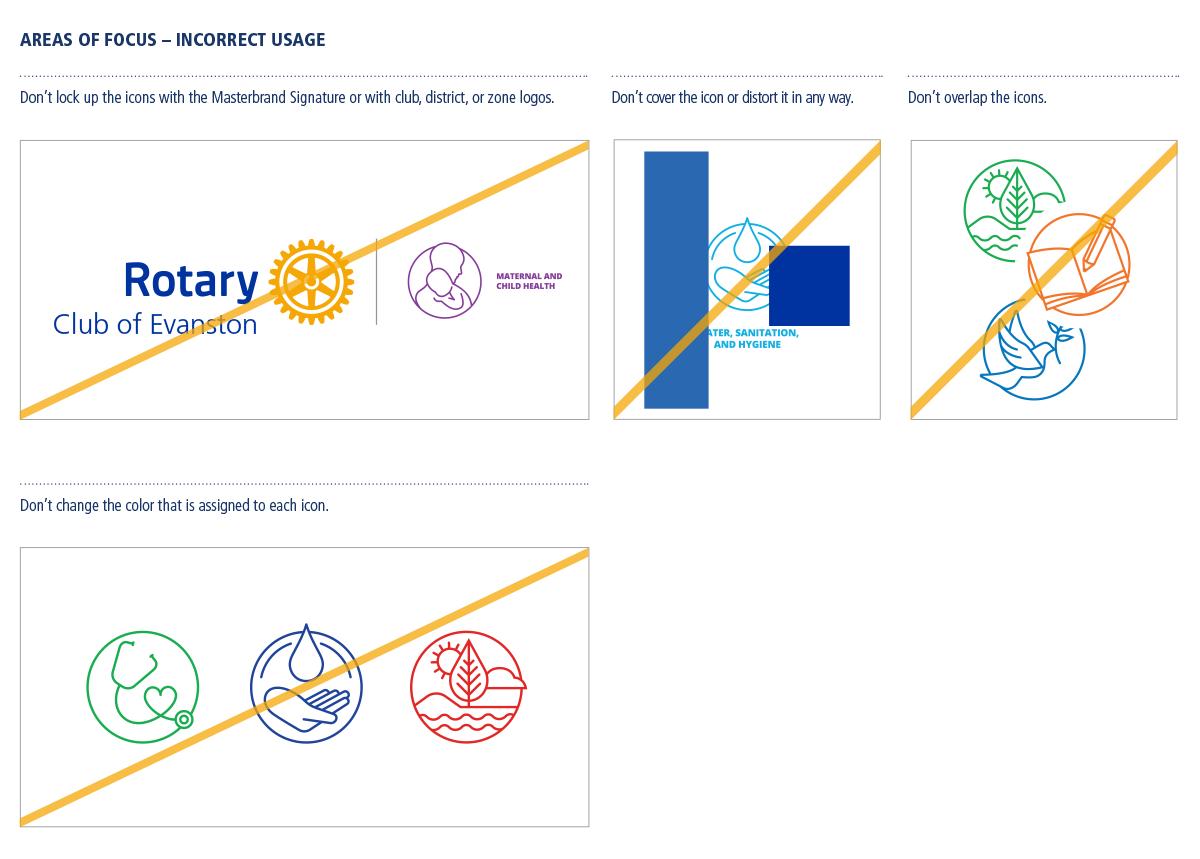
The areas of focus icons can’t be altered or manipulated in any way. You’ll strengthen people’s recognition of Rotary’s causes by using the icons correctly in your communications and promotions.
These examples show the icons used incorrectly.
